|
Behind The Covers An interview with Stylorouge - the company that designed most of All About Eve's artwork. |

|
|
The artwork and design of a record certainly play a very important role in how we perceive a band and their work, and can be a substantial part of the fascination we might feel for some. Sadly, very little is published about it in general, and with All About Eve it is no exception. So Frank & Goony are pleased to shed some light on the Eves' artwork from the Phonogram era (1987-91) after spending an afternoon talking to Rob O'Connor, proprietor and Creative Director of Stylorouge, at their West London premises in August 2000. Rob O'Connor studied graphic design in Coventry and Brighton and founded the design & art direction company Stylorouge in 1981, after leaving Polydor art department. Some of his earliest works include designs for Siouxsie and the Banshees and the Level 42 debut album, and he and his company are well known for outstanding graphics for artists like Blur, George Michael, Kula Shaker, Sarah Brightman, Squeeze and Rolling Stones, to name just a few. In 1997, he spent four months at UCLA in Los Angeles studying film direction and computer graphics. O'Connor is an avid collector of many kinds of music, favourites include David Sylvian and many soundtracks, and he enjoys reading and football. 
Having started as a one man enterprise (O'Connor and a drawing board), Stylorouge has become one of the leading design companies working with all the well known labels. With a current staff of about a dozen people, Stylorouge doesn't only create designs for record covers, but pursues a wide range of projects including film and promo videos, multimedia, promotion campaigns, cosmetics packaging and many more. Find out more about Rob O'Connor and Stylorouge by checking out their interesting website at www.stylorouge.co.uk. How was your relationship with All About Eve ? I enjoyed working with them, they are such nice people. Originally they were very mistrustful of the whole marketing business, and the marketing and the design go hand in hand. I think they wanted to keep their indie spirit. Also, I don't think they felt that the major record companies understood where they were coming from musically. Julianne especially has such a folky soul, and there are not many people in the major record companies that understand roots music, or whatever you want to call it. What happened to the original artwork ? It's all gone. All the original artwork was flat, old style. Generally this meant that the artwork was a combination of the transparency or the illustration and the mechanical artwork which is itself generally not in colour. We had years and years worth of things in cupboards, and we moved premises about five years ago - we had to lose it. It's difficult to hang on to that stuff, and I don't like to be nostalgic really, I just think you've got to move on. Our artwork is saved on disc now. Every now and then you have a subject that is a bit special, and a band that you want to work with, and then you get a bit more feeling about it. All About Eve were always one of those bands that I really liked the work we did for. Do you meet all these bands here in person when you start a project or does the record company ask you to work out something in a certain direction? Ninety percent of the time we meet the band, and I've always said to people that's important, especially nowadays. Since Sgt. Pepper and all the really good Andy Warhol covers, people have thought it's a credible and worthwhile part of the overall package, and it helps if the artist is involved. I firmly believe that the best covers look like they've come from the artist themselves, not from a design company. Isn't it sad you usually don't get too much feedback for your work and just a tiny credit on the sleeve ? No, not really, you know it's one of the areas of design where you do get credit, so that's enough really, and if people want to find out more, they are usually quite clever about it. I'm not terribly modest about it, I think if people want to find out they will, and with the internet now it's much easier. Did you conceive all these different formats or was it the record company that came up with the idea ? No, that format thing was horrendous, but of course we profited from it, because there was so much more work to do. I can't remember what formats we did on each release, in fact I don't have all the samples of everything. Sometimes the record companies don't give you samples, and if you are constantly on the phone saying "We still haven't had those samples" they're gonna get fed up with you, so we've tempered that over the years. With December, I do remember knowing that there were poster formats and picture discs, and when we did the photography, I remember arranging for it to be shot much bigger than it needed to be so we could do every format with it we needed. Anyway, that was a terrible time in the music business. In The Clouds (1987)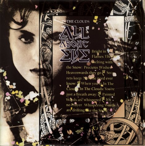
We did a shoot with the band with Tansy Spinks. Tansy wasn't really a portrait photographer, she's definitly not a pop photographer or at least she wasn't then. She had just left college, and her work was really beautiful. She did her own printing. The band liked the idea of her not being tainted by the pop industry. They got on very well, and we did a shoot at the Manor, where they were recording the album, and this was one of the shots from it. Because she does her own printing, we got her to do this print with bits of acrylic plastic she cut out and laid on top of the paper, and they were handcoloured. They seem a bit crude now. It's not that long ago but computers have changed things so much. But, don't you think that, especially for a band like the Eves, it benefitted from the fact that it was all handmade at the time? Yes, maybe it did, and even now we do use computers, we still try not to make it look like it's come from a computer. There are brilliant people who work on computers, they are amazingly efficient, but the techy look turns me off. We always try to make the use of a computer more organic. Do you work together with illustrators or other artists that are not in house staff ? We tend to keep more work in the house now, but we don't do too much photography on our own, there's too many good photographers out there to try and compete with them. And in terms of illustration, we don't use much illustration, in fact this [pointing at the frame with the snake motif] is a stock illustration, believe it or not, it just felt right for this. The whole thing here without Julianne's face was laid out to look like the title page of an old story book really, that was the idea. You know, like a children's book, but maybe a Victorian one. So this was supposed to look a bit Arts & Crafts, turn of the century - the 'sexy' bit at the front that made you carry on reading. We actually showed it to the band originally to say "Something like this", and they said "We love that, we want that". It was a stock illustration, so already copyright free. We were kind of lucky on that. The Debut Album (1988)Where did you get this fabric from with the fish motif ? 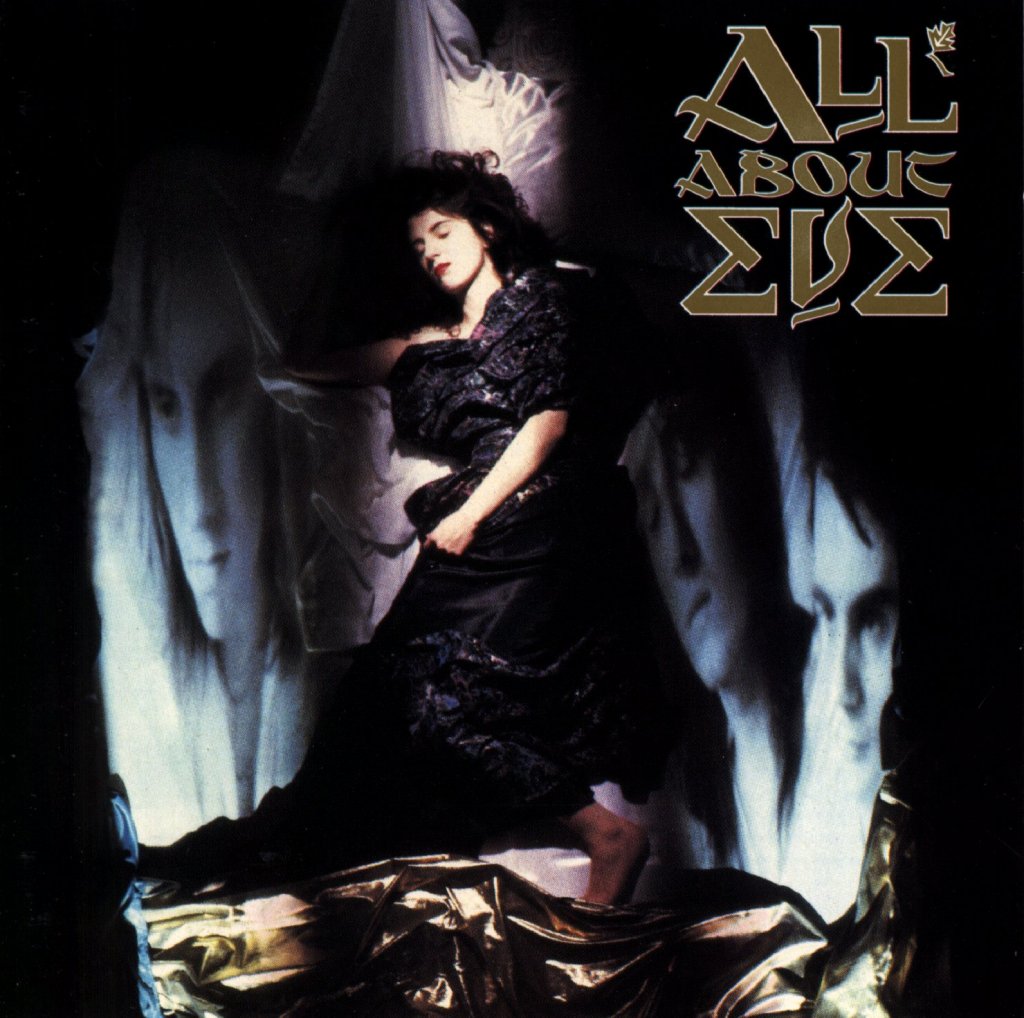
She was a textile designer called Anne Nicol, very nice girl, and we told her what we wanted was something, well... I've got a fascination with fish. We had a fish as a logo for our company, it wasn't personal, I just like fish. We were trying to think of a really nice abstract pattern that we just put lots of rich colours into. It doesn't look so good now does it?! [laughs] Having described this idea to Julianne, she was not convinced. There was a bit of a Gustav Klimt influence going on, you can see those gold spirals on the edge. We were worried about going too far that way and they wanted it a bit darker in spirit than Gustav Klimt. So we wanted a fabric that was unique, but wasn't a dress or whatever. If Julianne was a bit more racy as a character, we could have probably made this a more sensual image. I wasn't particularly wanting to show a half naked woman, but she could have pushed this as far as she wanted to go. The shots with the guys were taken earlier and these were being projected onto this fake bed; she was actually lying on a slope and the photographer was on a high step ladder shooting down. So this fabric was designed and printed by this girl Anne Nicol, in fact I still use this as a table cloth at home ! [laughs] 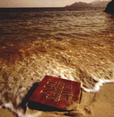
You slightly changed the band logo from the 'In The Clouds' sleeve to the version we have on the Debut. What was the reason behind that ? Well, this [the first version] was done in a hurry ! [laughs]. That's the truth behind it and afterwards I really wanted to do it much better. It's my own work, and I'm very self-critical. It's a hybrid of all kinds of different eras and historical contexts. I'm not very fond of it now. Although we did have a very good carver do the carving that was on this version [Marthas's Harbour, photo from the inner pages of the gatefold CD]. Martha's Harbour (1988) / Winter Words (1992)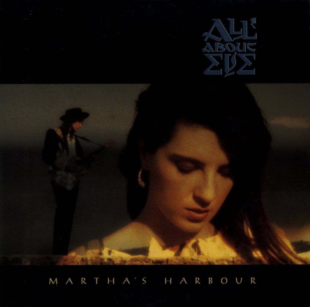
It was also used for the 'Best Of', the record
company didn't ask us if they could use the photograph. We took the carved
block to the shoot for the video for Martha's
Harbour. I went with the photographer Simon Fowler
[See some of his
Sarah Brightman pics], who is our friend and
works next door, to the shoot to get these pictures. Once again we did about
ten visuals for Martha's Harbour, and
the pressure was on by the record company to have Tim and Julianne on the front,
and we didn't really want that. I remember distinctly being at the drawing
board at like 10.30 at night still putting the artwork together for the next
morning, and thinking "I still don't like this cover!" I mean, it's
OK, but I think I set myself quite high standards with All About Eve and once
you've done something that you really like you want everything be as good as
that - that was the problem really.
That was a big hit, wasn't it ? So that's the
irony, when you have one of your least favourite covers become associated with
the biggest hit! The wooden block was pretty heavy in my
luggage. The idea was that it should look as if it'd been washed up on the
beach. When we submitted the photo session to Phonogram, we never got them
back. Then I was in a record shop years later and thought "That's one of
our pictures!" When I first saw it on a cover, it looked like
a piece of chocolate!
So Phonogram didn't let let you know at all
that they were putting together that 'Winter Words' compilation ? No, they just used the photos. At that stage, the band had been dropped, and the in house art department just put something together very cheaply. It was a nice compilation in terms of what music was on it, it had some lovely tracks, and it deserved better treatment. As you were on the location of the video shoot for 'Martha's Harbour', what do you think of the motorboat in it ? I thought it was a terrible idea, so wrong for All About Eve. They put them together with a very popular video director, Tony Vanden Ende. Tony is a really nice guy, but he is a bit Rock'n'Roll. He interpreted the song in his own style, and suddenly the galley became the speed boat ! With the stylists on this, we were really lucky. I don't know how the band feel about the way they were dressed now; They were called Pam and Claire, both wardrobe people with BBC. They came up with all the stuff, and I think, secretly all the guys quite liked dressing up in this slightly pompous fashion. The inside shots were taken in an old farmhouse, it was a beautiful location. What Kind Of Fool (1988)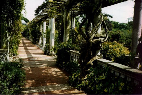
We were there [at the shooting location] in October I think, it was really cold. The model was dressed before it was light and everyone was sitting in cars waiting for the light to come up. The sun came up with ten or fifteen minutes to go before she had to go to do another job the same morning ! She's lovely, an Australian girl called Angela Dunn, and she was the ultimate Pre- Raphaelite model at the time. Two years after this I saw her in a really bad TV commercial for a foam bath or something, it was pretty embarrassing. But she fitted this perfectly. The photographer, who is a great friend of mine, was David Scheinmann, we've done lots of work together. The stylist was a girl called Zanna, who is now a photographer, very well known. I'm quite a fan of the Pre-Raphaelites. A lot of the paintings are autumnal in feel; David just used a warm up filter. It was very cold and we were really lucky to get these pictures. 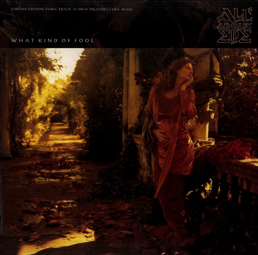
The Eves got a credit for co-designing this sleeve, what was their input ? When we asked Julianne about the song, she told me the story behind the lyrics - a woman who had been left behind by a lover and, I think she's pregnant. She's waiting for him to come home, just clutching the last letter he ever wrote. It's just about her waiting for him to come back. Julianne was very into this cover, this was the first one we had done for them where she got really involved. Scarlet And Other Stories (1989)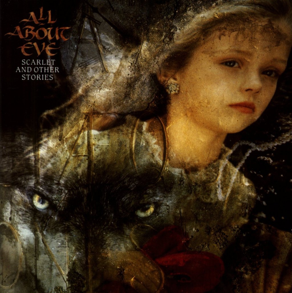
There's one major thing I would change about this now, I'd get rid of this earring. I don't understand why we had her wear them, she's only about eight years old. This was a very well-liked photographer called Holly Warburton, who does everything like this! [laughs] I mean this is her thing, it's building layers in camera, very time consuming, this was like a week or more of work for her. Julianne wanted to call it Scarlet and Other Stories, because she'd already written the song Scarlet and it was so fairy tale, children's booky, we really wanted to develop that thing. Julianne, myself and Holly just talked about the kind of images that provoke children's dreams and things. Some of the elements are a bit subtle, I mean these are pearls under water [on the right handed side]. A lot of this relates to lyrics of the songs. The letters on the left side were carved by the photographer's boyfriend. We wanted the words to be totally abstract, so you couldn't read it. She does all this aging stuff [the stone-like structures put on top of the images], making things look as if they have been in a graveyard for a hundred years. She used to do album covers for Danielle Dax [ See some Holly Warburton pics ], I was a huge fan of Danielle's. All the elements were shot separately and then re-photographed together as projections. I found this particularly pleasing, all the shots of the band [on the back cover]. As straightforward pictures of the band, they were really ordinary, you wouldn't look twice. But as soon as this stuff happens they come to life. 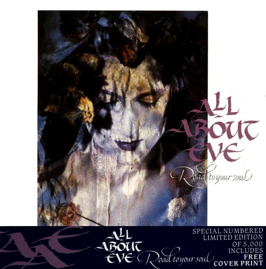
Road To Your Soul (1989)The model was apparently a friend of Holly's and this was a picture she took just for her own portfolio. We all thought "Yeah, we can develop this idea" and that's how we got to Scarlet. December (1989)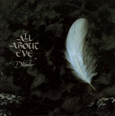
This [pointing at the backgound] is actually a piece of burned wood. The photograph is by a still life photographer called Geoff Brightling. Did he use a filter to make it look so greenish ? Not particularly, I think the lighting was just kept very cool. It's not a great cover is it, when you think about it? In fact, the back is nicer than the front! [laughs] Farewell Mr. Sorrow (1991)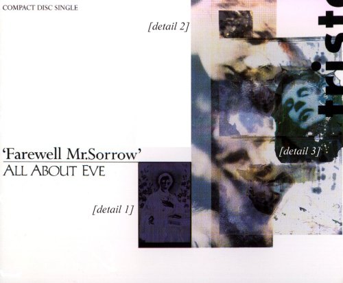
This is a saint [See picture detail 1], from a little postcard. This [detail 2] was an old Victorian photograph I believe, and this [detail 3] is actually a manipulated portrait taken by Simon Fowler, so it has nothing to do with anything else, it's actually someone from another band, I think! We put this together on a computer and changed the face because I didn't want to upset anyone, but Simon was more than happy for us to use it. All the elements were scanned and laid over the top of one other. I took these pictures on the back of the band, which is unusual. I don't think I have ever been closer to a band than at that point, we were doing most visual things together. I directed the video [the promo clip for Farewell Mr. Sorrow] and we did the covers. By this stage another Stylorouge designer called Chris Thomson was involved and in many ways was helping to freshen the look, I think made it more contemporary. Touched By Jesus (1991)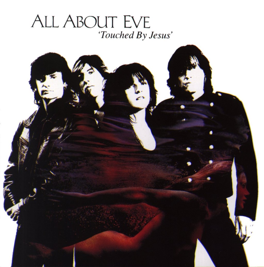
The album cover was very disappointing, I really wish that we kept all the original visuals because the way we got to this is disastrous. I mean, this is definitly reflective of panic - it's the major record company saying "You're gonna be on the cover, you're a good looking band especially now you've got Marty in" and the band and I fought for some time for them not to be on the cover. The idea of this woman swimming through the band shot was really just a way of saying "Let's do something with it", because the record company were just talking about a black & white image of the Eves. It's a great disappointment I must say. I like these stills [the small pictures on the back cover] because they were a much stronger indicator of the spirit of All About Eve. I like the way they sat together with the portraits as well. Strange Way (1991)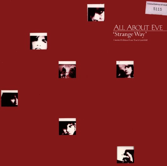
There was one nice item from this, which was a
12" with little die cut holes. It was an idea I had years before for
Siouxsie and the Banshees for the album Kaleidoscope.
The idea was to create a grid with lots of tiny images, very colourful, and
then have a grid of holes on the black outer. When you pulled the inner sleeve
through you got the idea of the pictures actually twinkling in different
configurations - everytime you pull it you get a different sleeve. 
Many thanks to Rob O' Connor for his efforts and devoting his time !
| |
|
Visit the articles page for more interviews.
|
|
